Exercise 16. Strength of Interpretation:
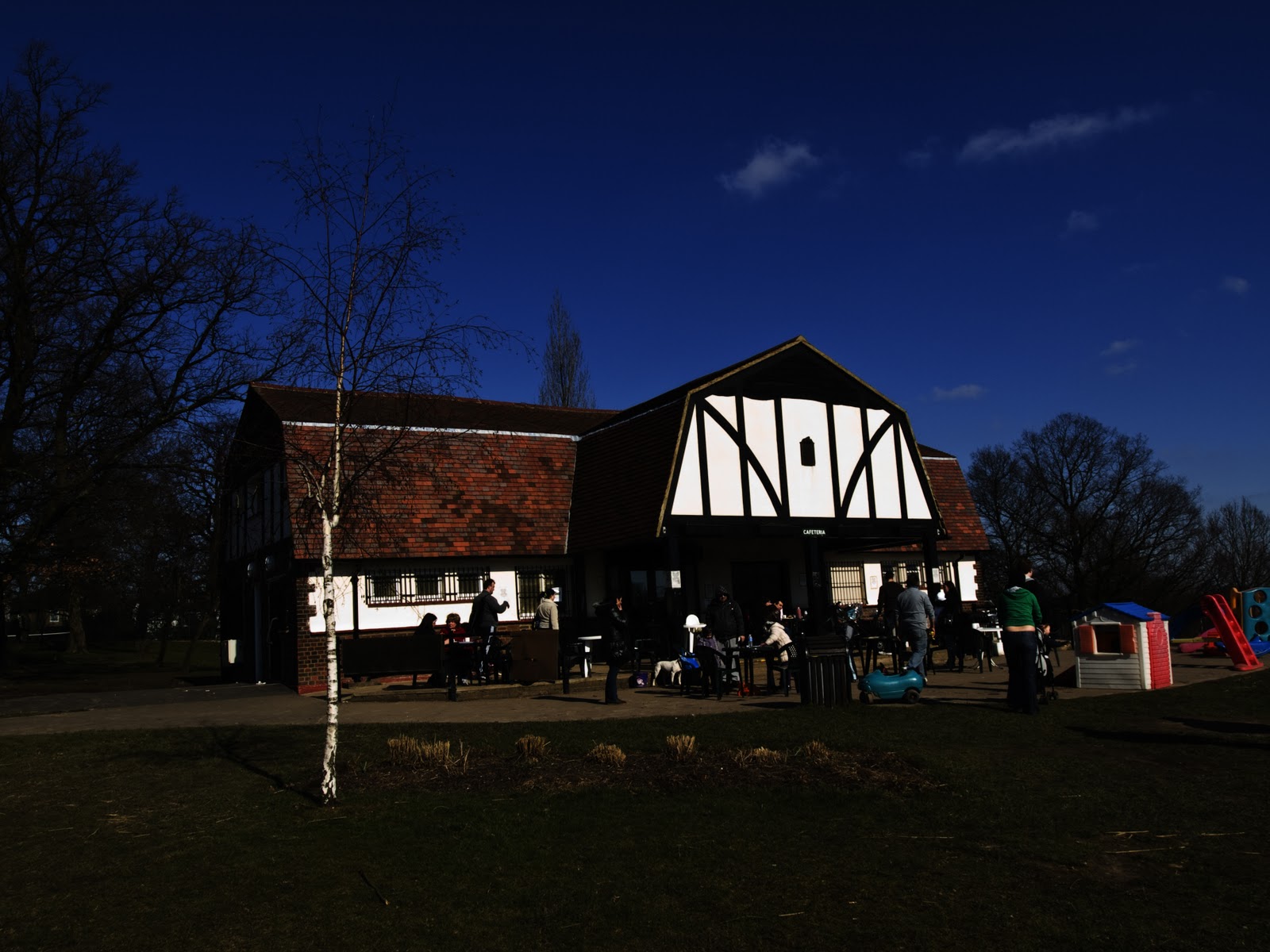
 Image 1) Park Pavilion.
 High Contrast - Colour.
Harsh colours caused by the high contrast are not appealing.

High Contrast - Black and White.
Here the application of high contrast has created
a dramatic scene of perhaps a storm laden sky with the low evening sun highlighting the pavilion.

High Key - Colour
This image has a certain appeal - a water colour
effect. Splashes of colour draw the eye around the image.

High Key - Black and White.
An almost ethereal light. A black and white
etching. It almost demands further investigation.
The delicate nature of the images created by the
low key application I find particularly appealing.
low key application I find particularly appealing.
Low Key - Colour.
The colours do not respond well to the low key
conditions.

Low Key - Black and White.
Apart from the white facings, the low key black and white is quite acceptable. This could well be a late summer evening with drinks on the terrace.

High Contrast - Colour.

Image 2) Bronze Sculpture.
The high contrast version of the image
shows little colour apart from the sky
shows little colour apart from the sky
and a colour distortion of the stone base.
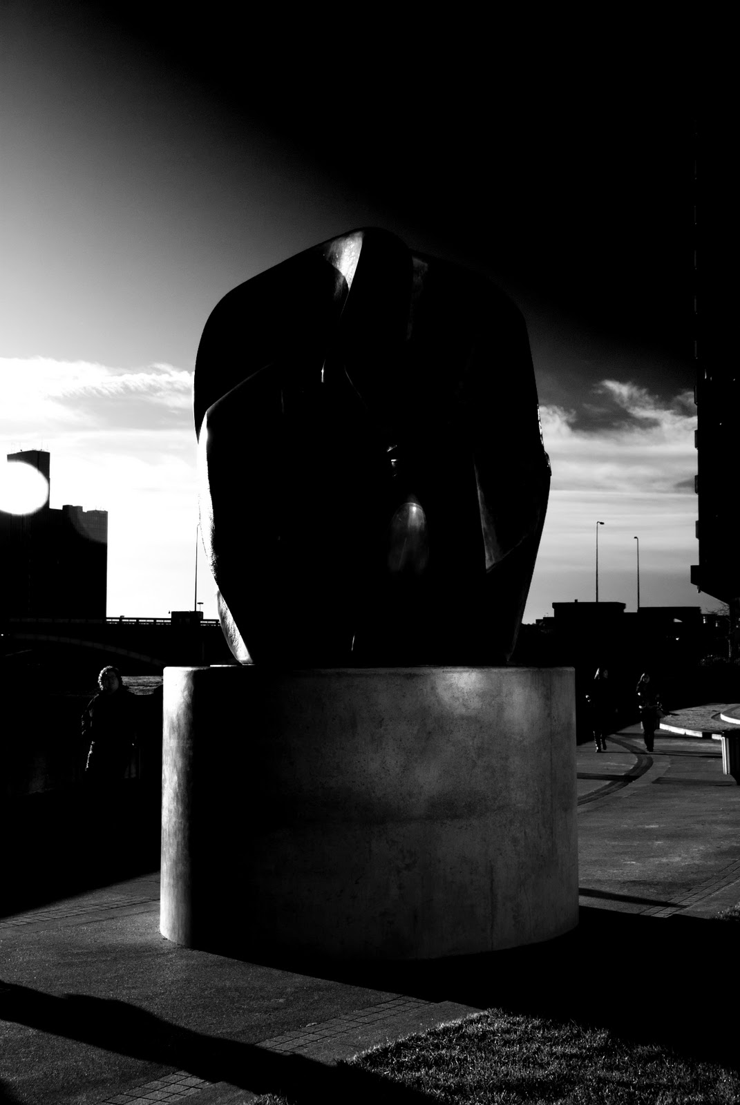
High Contrast - Black and White.
Although very little extra detail is shown in
the actual sculpture, more toning of the base
and ground is evident. The sky has changed
from a rather bland uninteresting blue to
one of considerable drama.

Although very little extra detail is shown in
the actual sculpture, more toning of the base
and ground is evident. The sky has changed
from a rather bland uninteresting blue to
one of considerable drama.

High Key - Colour.
The high key shows considerable detail of
the actual bronze sculpture. Unfortunately
most of the other detail including the base
has been lost.

High Key - Back and White
The tonal range is better than the colour
version. As much detail is present in the
sculpture as in the colour version but more
detail is evident elsewhere giving more
sense to the image.

Low Key - Colour.
This low key image has some drama.
Almost a contre-jour image leaving a
lot to the imagination.

Low Key - Black and White.
Both the colour and this black and white
version were modified using 'Curves'
using the same input and output values.
There is little to chose between the two
images. ''Do not assume that a black and
white image will be, in all circumstances,
an improvement of the coloured version.''
the actual bronze sculpture. Unfortunately
most of the other detail including the base
has been lost.

High Key - Back and White
The tonal range is better than the colour
version. As much detail is present in the
sculpture as in the colour version but more
detail is evident elsewhere giving more
sense to the image.

This low key image has some drama.
Almost a contre-jour image leaving a
lot to the imagination.

Low Key - Black and White.
Both the colour and this black and white
version were modified using 'Curves'
using the same input and output values.
There is little to chose between the two
images. ''Do not assume that a black and
white image will be, in all circumstances,
an improvement of the coloured version.''
No comments:
Post a Comment